
The Font that Muse have used, uses binary opposition of black and white, along with the balance between text and background, to create a sense of isolation.
They also challenge the stereotypes as they use all capital letters to separate from doing things like they should be done in society, for example, we are taught to only use capital letters at the start of names/places and sentences.
The border that is used to outline the text is unique in the fact that it isn't all 4 sides of the rectangle its just the top and the bottom, almost showing the band as being pressed down on or pressured.

Linkin Park's logo uses abstract imagery to show the bands initials through a spiral like shape. This aligns with the codes of the genre as the genre likes to explore being different and not doing the same things or style as others.
The symbolism for spirals usually mean the nature of life as it starts in the middle and expands outwards much like life is structured, this can be a message for the audience influencing them to live their lives to the fullest.
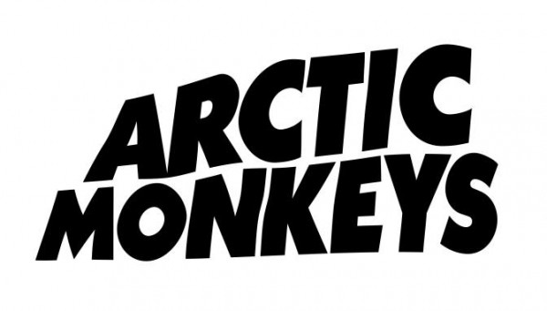
The Arctic Monkey's font contains elements of lacking perfection or not being totally normal, this is extremely important when considering the conventions of the genre, as they are known for expressing themselves even if they aren't perfect.
This is also contrasted to the other fonts/logos, that I have looked at as the colours are reversed from the traditional white on a black background.


